Virtual Service Analytics
About Virtual Service Analytics
The VS analytics tab presents information about the virtual service performance metrics. All charts and metrics reflect the display time selected.
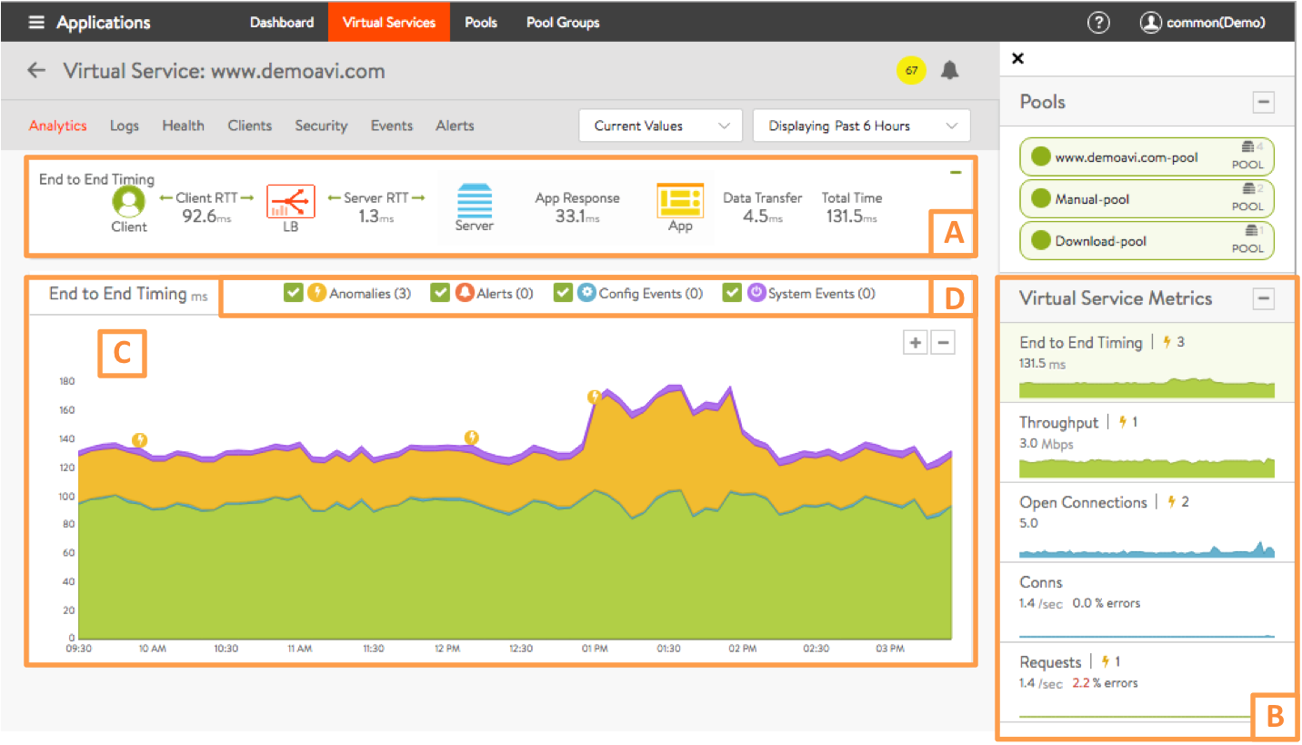
This article is broken down into the following sections, outlined in the graphic above.
- End-to-End Timing (A)
- Metrics tiles (B)
- Chart pane (C)
- Overlay pane (D)
End-to-End Timing (A)
The End to End Timing section provides a high-level overview of the quality of the end-user experience and where any slowdowns may be occurring. The chart breaks down the time required to complete a single transaction, such as an HTTP request.
You may find it helpful to compare the end-to-end time against other metrics, such as throughput, to see how increases in traffic impact the ability of the application to respond. For instance, if new connections double but the end-to-end time quadruples, you may need to consider adding additional servers. You can expand or collapse this pane by clicking the + or – sign in the upper right-hand corner.

From left to right, this pane displays the following timing information:
- Client RTT: Average network TCP latency between the client and Avi Vantage for all clients, both local (within the same datacenter) and remote (Internet). This metric indicates how long it takes to establish connections and return acknowledgements. Because this is TCP, this number will often be higher than an ICMP ping.
- Server RTT: Round-trip latency for SE-to-server traffic. An abnormally high server RTT may indicate either that the network is saturated or more likely that a server’s TCP stack is overwhelmed and cannot quickly establish new connections.
- App Response: The time the server took to respond. This includes the time the server took to generate content, potentially fetch backend database queries, and begin transferring the response back to Avi Vantage. This time is calculated by subtracting the server RTT from the time of the first byte of a response from the server. If the application consists of multiple tiers (such as web, applications, and database), then the App Response represents the combined time before the server in the pool began responding. This metric is only available for a layer 7 virtual service.
- Data Transfer: Average time required for the server to transmit the requested file. This is calculated by measuring from the time the SE received the first byte of the server response until the client has received the last byte, which is measured as the when the last byte was sent from the SE plus one half of a client round trip time. This number may vary greatly depending on the size of objects requested and the latency of the server network. The larger the file, the more TCP round trip times are required due to ACKs, which are directly impacted by the client and server RTT. This metric is only used for a layer 7 virtual service.
- Total Time: Total time from when a client sent a request until they received the response. This is the most important end-to-end timing number to watch, because it is the sum of the other four metrics. As long as the Total Time value is consistently low, the application is probably successfully serving traffic.
Metrics Tiles (B)
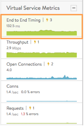
Metrics tiles continuously display time-averaged data. Clicking a metrics tile causes a corresponding display of that data over time in the chart section (C). The following metrics choices are available:
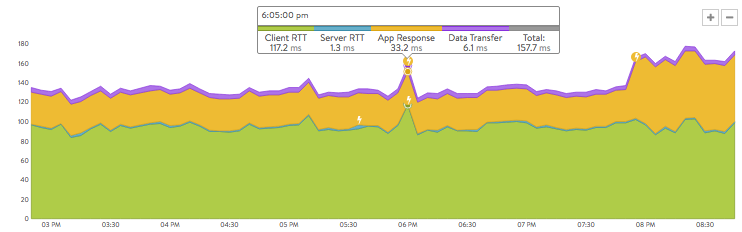
- End to End Timing is the default metrics tile, and causes end-to-end timing to be charted by default when the Analytics tab comes up. Metrics tiles govern what appears in the chart display. shown in figure 1. The chart display in section C is based on the same kind of information appearing in section A, but plotted over time, with color-coding in the mouse-over popups to indicate the client RTT, server RTT, data transfer, and app response times at any recorded instant. Figure 4 breaks down the 157.7 ms total for a transaction that occurred at 6:05:00 pm.
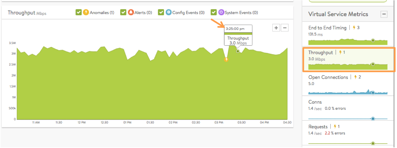
* Throughput is the total bandwidth passing through the virtual service, in Mbps. Hovering the mouse cursor over this graph displays the throughput in Mbps for the selected time, as indicated by the orange arrow in figure 5. Throughput is measured as bytes transferred between the client and Service Engine, which does not include data transferred between Service Engine and the servers.
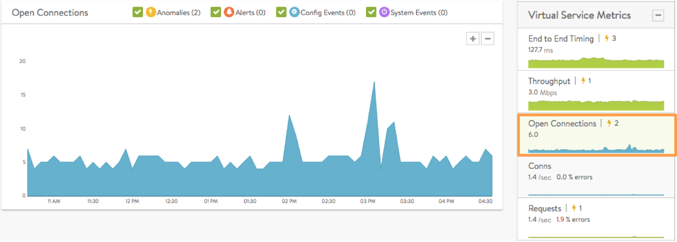
- Open Connections are the number of TCP client connections or UDP transactions currently in an open state. UDP transactions are counted even though they are technically connection-less. The number of open connections does not necessarily translate into the number of unique clients, as protocols such as HTTP 1.1 typically open six connections per client browser. If the Maximum Concurrent Connections setting has been set for a virtual service, a horizontal red bar superimposed over the chart pane will show the maximum number of connections allowed. Read the Rate Shaping and Throttling Options article for more information.
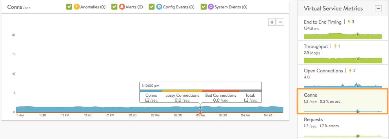
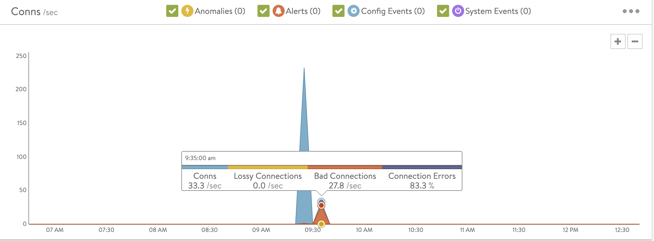
- Conns shows the average rate of connections completed per second. The tile also summarizes the percent of connections resulting in errors. The chart’s mouse-over popup further breaks down the total by showing the rates of good, lossy and bad connections. Lossy connections are those that experience issues such as retransmissions, zero window size events, or high connection setup times. Bad connections are those which terminate ungracefully.
Example:
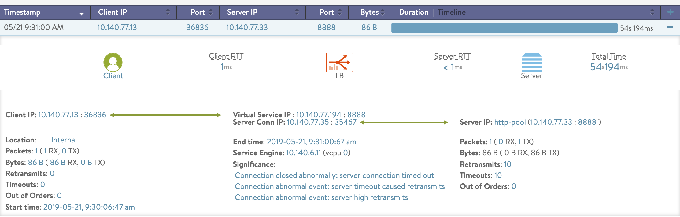
Connection closed abnormally and request ended abnormally will result in BAD connections. Also, connection abnormal event will result in lossy connection. Example:
=== Connection Closed Abnormally =========
== The connection was terminated post a setup

Connection closed abnormally: client aborted connection
Connection closed abnormally: server aborted connection
Connection closed abnormally: client connection timed out
Connection closed abnormally: server connection timed out
Connection closed abnormally: conn deleted due to config update
Connection closed abnormally: timed out waiting for HTTP request from client
Connection closed abnormally: connection was prematurely closed by the client

Connection closed abnormally: connection dropped due to SSL handshake failure
Connection closed abnormally: connection was closed due to internal error
Connection closed abnormally: server x509 certificate verification failed
Connection closed abnormally: connection dropped due to server side SSL handshake failure

Connection closed abnormally: connection idle timed out
Connection closed abnormally: Connection was closed before client sent HTTP request


== Connection Abnormal Event ==
=== These are not connection drops but are not normal events

Connection abnormal event: client timeout caused retransmits
Connection abnormal event: server timeout caused retransmits
Connection abnormal event: zero window from client
Connection abnormal event: zero window from server
Connection abnormal event: client high rtt
Connection abnormal event: server high rtt
Connection abnormal event: client high retransmits
Connection abnormal event: server high retransmits
Connection abnormal event: client out of order packets
Connection abnormal event: server out of order packets
Connection abnormal event: zero window to client
Connection abnormal event: zero window to server
Connection abnormal event: client possible window stuck
Connection abnormal event: server unanswered syns
Connection closed abnormally: connection was closed on VS config update


== Request Ended Abnormally==
== Mostly for HTTP/HTTPS VS where the request was dropped

Request ended abnormally: response code 4xx
Request ended abnormally: response code 5xx
Request ended abnormally: no available servers
Request ended abnormally: Datascript failed to execute
Request ended abnormally: request failed to select pool
Request ended abnormally: Too many requests from this client IP
Request ended abnormally: Too many requests for this URI
Request ended abnormally: Too many requests for this URI from this client IP
Request ended abnormally: Too many requests for an unknown URI
Request ended abnormally: Too many requests for a bad URI
Request ended abnormally: Too many requests from an unknown client IP
Request ended abnormally: Too many bad requests from this client IP
Request ended abnormally: Throttled by the header-based rate limiter
Request ended abnormally: Throttled by the custom string-based rate limiter
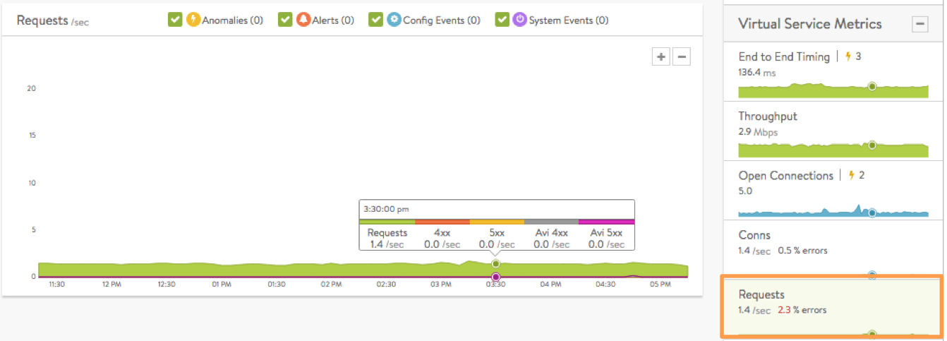
- Requests are the number of responses to requests per second, which breaks down successful requests versus errors (such as 4xx or 5xx errors). Within the chart pane you may toggle radio buttons to break down the errors by whether they are generated by the server or by Avi Vantage. For instance, if no servers are available in the pool, Avi Vantage will send out an HTTP 500 status code. The Client Logs section will provide more detail on specific errors. This metric is only available for HTTP virtual services.
- HTTP vs HTTP2 Requests (18.2.5+) are displayed in the form of requests-per-second rates.
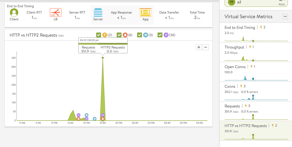
Chart Pane(C)
The chart pane in the middle of the Analytics tab displays a detailed historical chart of the selected metric tile for the current virtual service.
Hovering the mouse over any point in the chart will display the results for that selected time in a popup window, as shown in figure 9.
- Clicking within the chart will freeze the popup at that point in time. This may be useful to keep track of a datapoint even while the chart scrolls leftward as time passes.
- Clicking again will unfreeze the highlighted point in time.
Many charts contain radio buttons in the top right that allow you to customize which data should be excluded from the chart. For example, if the End to End Timing chart is heavily skewed by one very large metric, then deselecting that metric by clearing the appropriate radio button will re-factor the chart based on the remaining metrics shown. This may change the value of the vertical Y-axis.
Some charts also contain overlay items, which will appear as clickable color-coded icons on the chart itself.
Overlay Pane (D)
The overlays pane allows you to overlay one of four icons to signify important behaviors exhibited over the time period depicted in the chart pane. This feature helps correlate anomalies, alerts, configuration changes, or system events with changes in traffic patterns.
Within the overlays pane:
- To the right of every overlay type icon appears the number of entries for the selected time period. For example, figure 1 shows that in the past 6 hours there were 3 anomalies, but no alerts, no configuration events, and no system events.
- Clicking an overlay button toggles the appearance of that overlay’s icons within the chart itself.
- The following overlay types are available:
- Anomalies are instances of anomalous traffic, such as a spike in server response time, along with corresponding metrics collected during that time period. Anomalous behavior is by no means synonymous with bad behavior. Rather, it is behavior that Avi Vantage’s historical observations suggest are out of the ordinary.
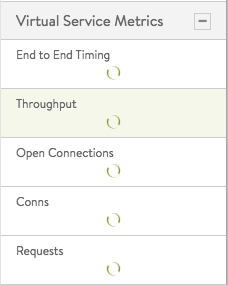
Figure 13. Controller busy - Alerts are filtered system-level events that have been deemed important enough to notify an administrator.
- Config Events track configuration changes made to Avi Vantage by either an administrator or an automated process.
- System Events are raw data points or metrics of interest. System events can be noisy, and are best used as alerts that filter and classify these raw events by severity.
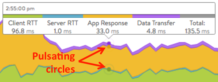
Note: When selecting increasingly long time periods, the Controller needs to pore over a potentially very large amount of historical data. This will be indicated by spinning circles in the metrics tiles, as shown in figure 13.
Anomalies Overlay
The Anomalies overlay indicates times at which Avi Vantage perceives abnormal traffic behavior, based on its historical moving averages. To be more specific, the metric has a deviation of 4 sigma or greater across the moving average of the chart.
Changing the time interval of the chart will provide greater granularity and potentially show more anomalies. Clicking the anomalies overlay checkbox ![]() displays yellow-coded anomaly icons in the chart panel. During times of anomalous traffic, Avi Vantage records any metrics that have deviated from the norm, which may provide hints about the root cause.
displays yellow-coded anomaly icons in the chart panel. During times of anomalous traffic, Avi Vantage records any metrics that have deviated from the norm, which may provide hints about the root cause.
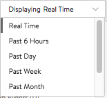
Note: Anomalies are not recorded or displayed if the statistics interval is set to Real Time in the Displaying pulldown menu, as shown in figure 12.
These metrics are defined as follows:
- Timestamp when the anomaly was detected. This may either span the full duration of the anomaly, or merely be near the same time window.
- Type is the specific metric deviating from the norm during the anomaly period. To be included, the metric deviation must be greater than 4 sigma. Numerous types of metrics, such as CPU utilization, bandwidth, or disk I/O may trigger anomalous events.
- Entity names the specific object that is reporting this metric.
- Entity Type: Type of entity that caused the anomaly. This may be one of the following:
- Virtual Machine (server). These metrics require Avi Vantage to be deployed in read access mode or write access mode to the virtualization orchestrator (for example, vCenter or OpenStack). In the example above, CPU utilization of the two servers was learned by querying vCenter.
- Virtual Service
- Service Engine
- Time Series: Thumbnail historical graph for the selected metric, including the most current value for the metric which will be data on the far right. Moving the mouse over the chart pane will show the value of the metric for the selected time. Use this to compare the normal, current, and anomaly time periods.
- Deviation: Change or deviation from the moving average, either higher or lower. The time window for the moving average depends on the time series selected for the Analytics tab.
Alerts Overlay
The alerts overlay displays the results of any events that meet the filtering criteria defined via Operations > Alerts. Alerts notify administrators about important information or changes to a site that may require immediate attention.
Alerts may be transitory, as they will expire after a defined period of time. For instance, Avi Vantage may generate an alert if a server is down and then allow that alert to expire after a specified time period once the server comes back online. The original event remains available for later troubleshooting purposes.
Clicking the alerts icon ![]() in the overlay items bar displays any red alerts icons in the chart pane. Selecting one of these chart alerts will bring up additional information below the overlay items bar, which will show the following information:
in the overlay items bar displays any red alerts icons in the chart pane. Selecting one of these chart alerts will bring up additional information below the overlay items bar, which will show the following information:
- Timestamp indicates when the alert occurred.
- Resource Name of the object that is reporting the alert.
- SeverityLevel of the alert. Use the priority level to determine whether additional notifications should occur, such as sending an email to administrators or sending a log to Syslog servers. The level may be one of the following:
- High: red
- Medium: yellow
- Low: blue
- Summary briefly describes the event.
- Actions:
- Dismiss the alert to remove it from the list and also remove the corresponding alert icon from the chart pane. Dismissing an alert here is the same as dismissing it via the bell icon at the top of the screen next to the health score
 or dismissing it via the Alerts tab.
 - Edit opens the alert filter configuration, which can be modified to make Avi Vantage more or less sensitive to generating new alerts.
- Dismiss the alert to remove it from the list and also remove the corresponding alert icon from the chart pane. Dismissing an alert here is the same as dismissing it via the bell icon at the top of the screen next to the health score
- Expand/Contract: Clicking the plus (+) or minus sign (-) for an alert either expands or contracts a sub-table showing more detail about the alert. This will typically show the original events that triggered the alert.
Configuration Events Overlay
The configuration events overlay displays configuration events. Configuration events typically involve changing the Avi Vantage configuration by adding, deleting, or modifying a resource such as a pool, virtual service, or SE, or an object related to the object being inspected. For example, if a virtual service’s traffic drops off at precisely 10:00 a.m., and at that time an administrator made a change to the virtual service’s security settings, there is a good chance the cause of the change in traffic can be attributed to the configuration change.
Clicking the configuration events icon ![]() in the overlay items bar displays any blue configuration event icons in the chart pane. Selecting one of these chart alerts will bring up additional information below the overlay items bar, which will show the following information, as depicted in figure 13.
in the overlay items bar displays any blue configuration event icons in the chart pane. Selecting one of these chart alerts will bring up additional information below the overlay items bar, which will show the following information, as depicted in figure 13.
- Timestamp indicating when the configuration change occurred
- Resource Name of the object that has been modified
- Resource Type of the object, e.g., Pool Server, Pool, Virtual Service, SE, etc.
- Event Code indicates the nature of the change:
- CONFIG_CREATE
- CONFIG_UPDATE
- CONFIG_DELETE
- Description: Brief description of the event.
- Expand/Contract: Clicking the plus (+) or minus sign (-) for a configuration event either expands or contracts a sub-table showing more detail about the event, as illustrated in figure 14. When expanded, this shows a difference comparison of the previous configuration versus the new configuration, as follows:
- Green: shows additions.
- Red: shows deletions.
- Yellow: shows changes.
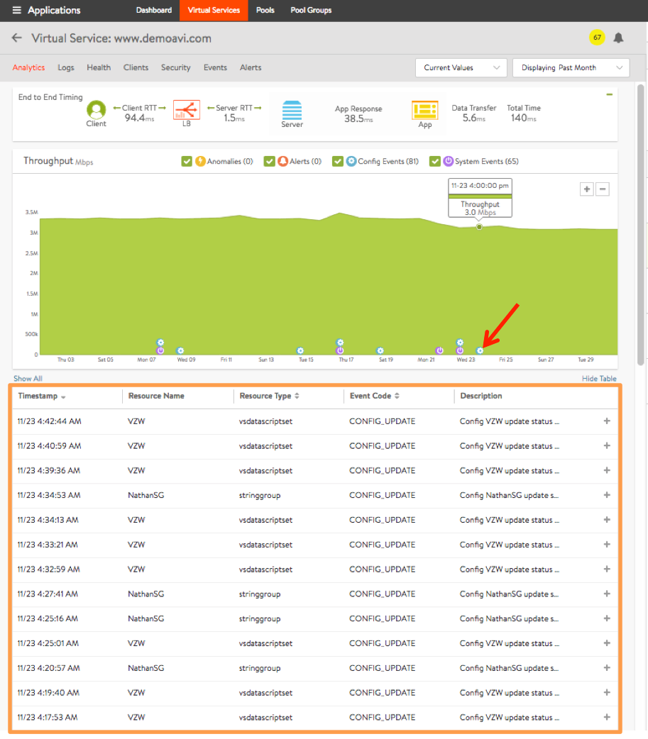
Figure 15. Clicking on the configuration event icon in the chart causes events for that day to be displayed. Moving the slider at right would scroll to reveal additional rows. 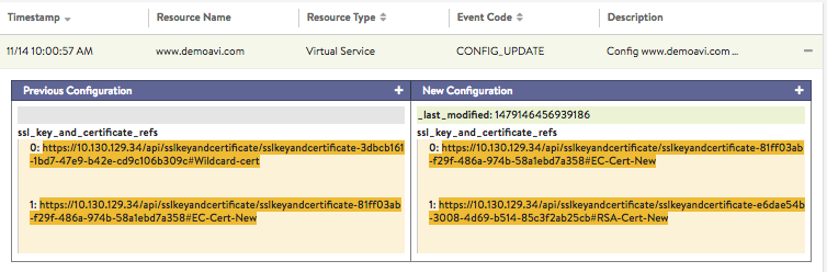
Figure 16. Clicking the + sign reveals details about the changes made on 14Nov at 10:00:57 AM.
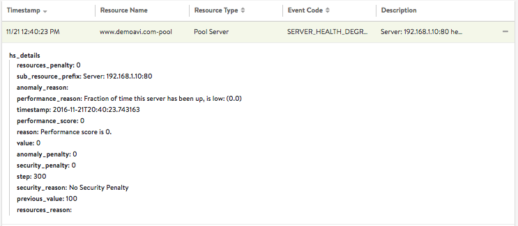
System Events Overlay
This overlay displays system events relevant to the current object, such as a server changing status from up to down or the health score of a virtual service changing from 50 to 100. Clicking the checkbox to the left of the system events icon ![]() in the overlay items bar causes any purple system event icons to appear in the chart pane. In figure 15, clicking on the system event icon in the chart pane (as indicated by the red arrow) bring ups a table of information.
in the overlay items bar causes any purple system event icons to appear in the chart pane. In figure 15, clicking on the system event icon in the chart pane (as indicated by the red arrow) bring ups a table of information.
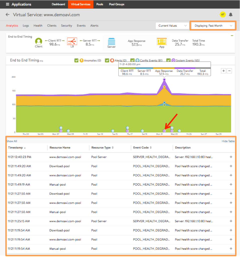
The table’s rows provide high-level information about each event at or close to the selected time.
- Timestamp indicates when the system even occurred.
- Resource Name identifies the object that triggered the event.
- Resource Type indicates the type of resource involved, e.g., virtual service, pool, pool server, etc.
- Event Code is a high-level definition of the event, such as SERVER_HEALTH_DEGRADED, POOL_HEALTH_DEGRADED, VS_HEALTH_CHANGE or VS_UP.
- **Description **briefly describes the system event.
- Expand/Contract a single row by clicking the plus (+) or minus sign (-). Expanding reveals more information, as shown in figure 16.